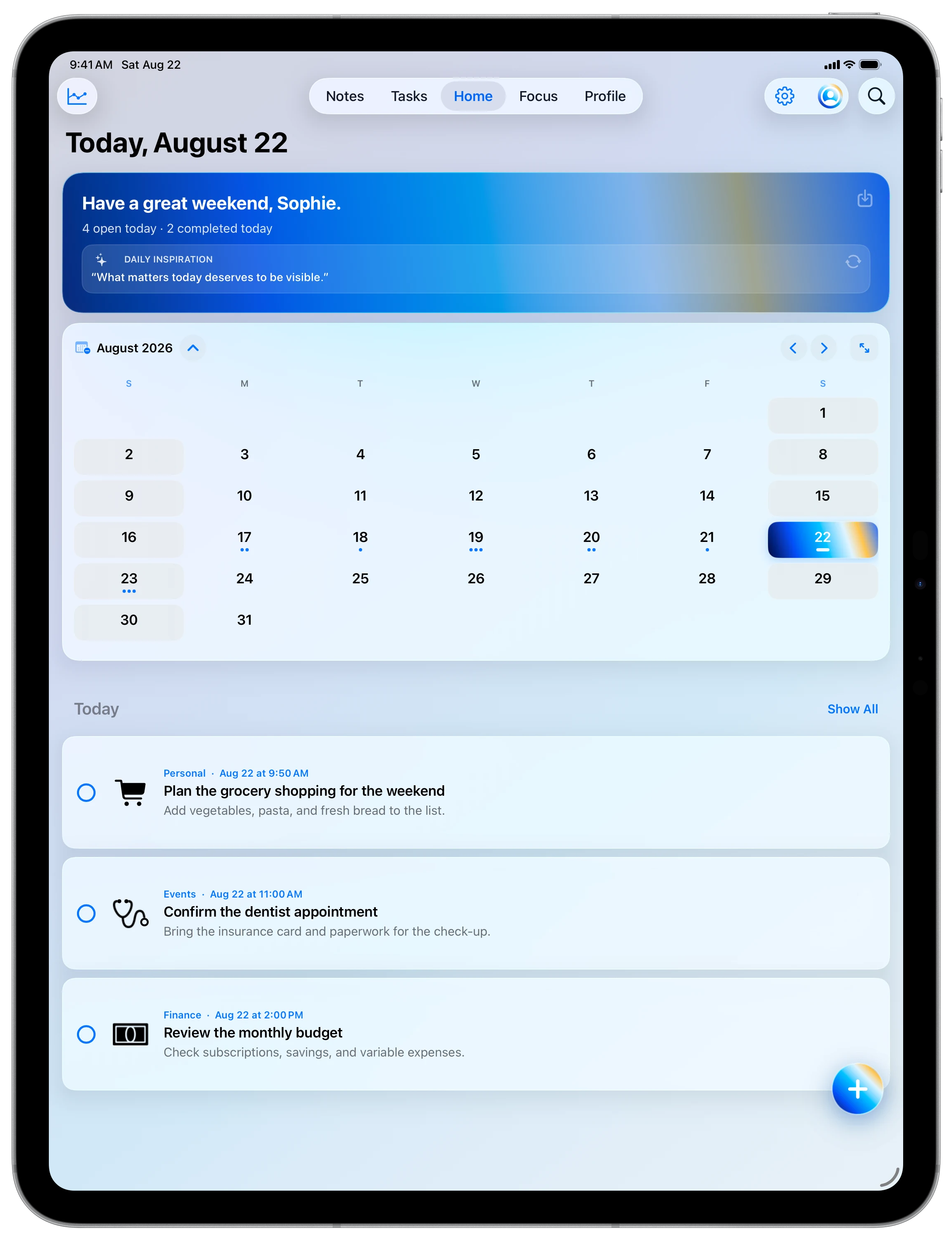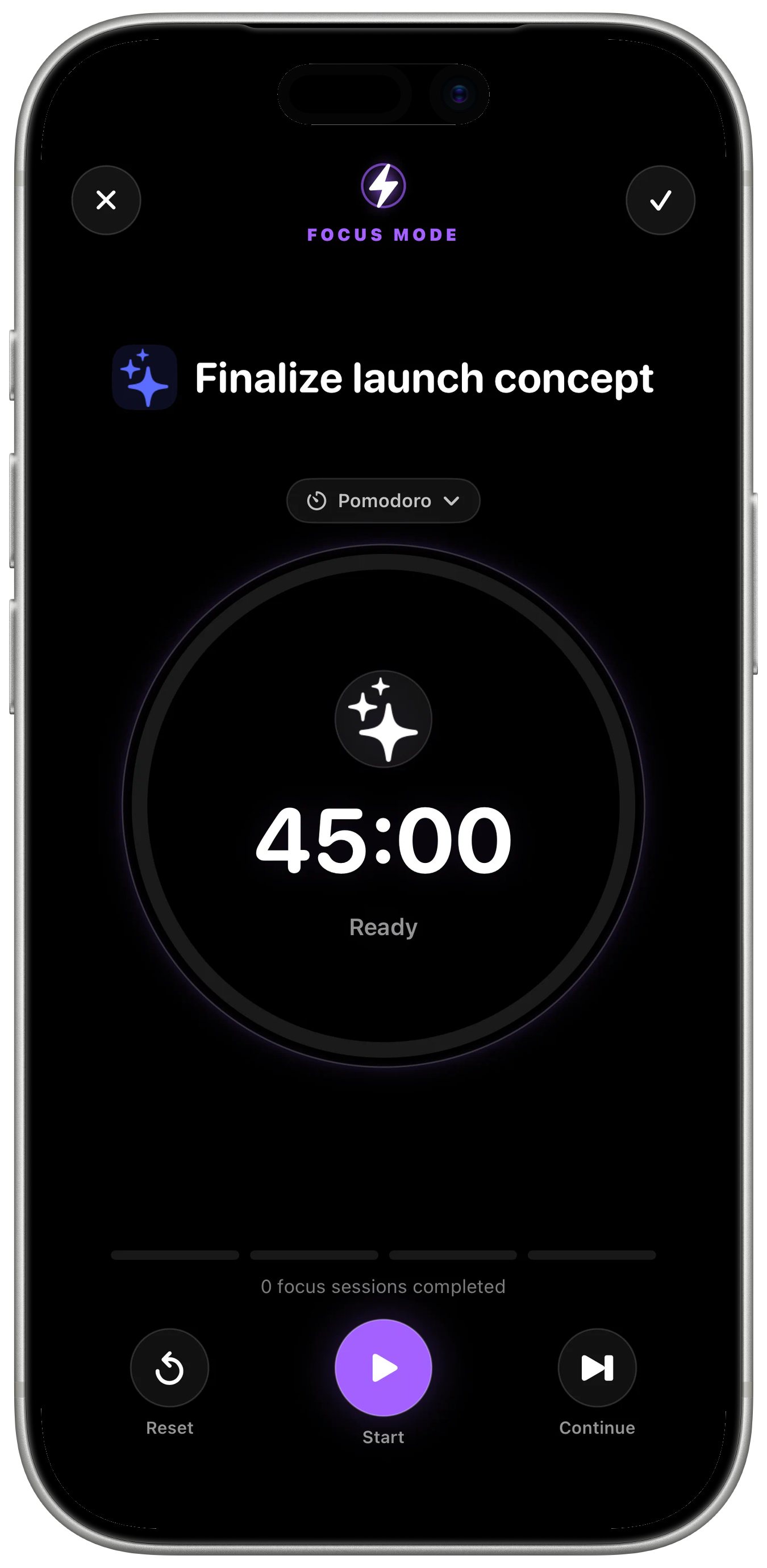
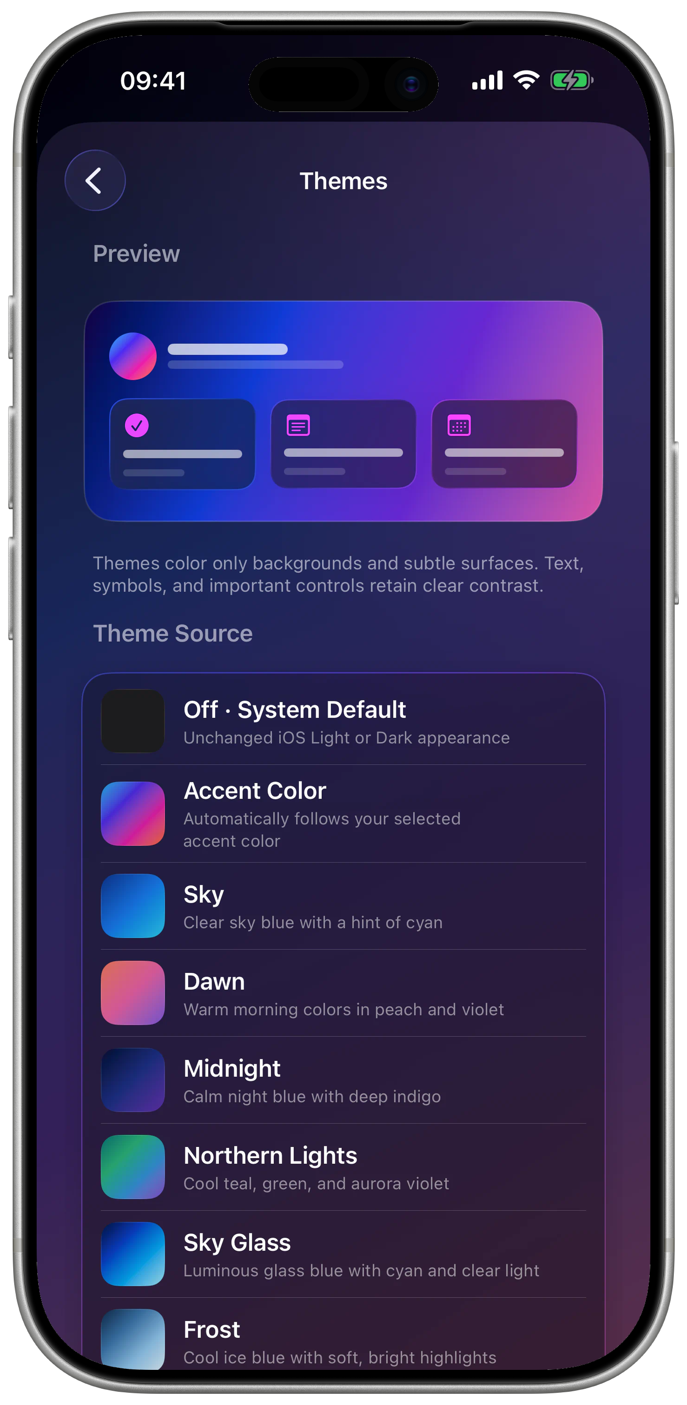
Personalization is more than decoration. A familiar color system can support orientation and make a tool feel more like your own workspace.
Choice without chaos
Accent styles, intensity, light and dark appearance, and alternate app icons change the character while structure and readability stay intact.
System-led or deliberately chosen
You can follow the device appearance or choose a specific mood. Either choice remains easy to reverse.
Identity with a purpose
Color highlights active areas and important actions. It should not only look good; it should make the interface easier to understand.